
The Concert Poster as an Extension of Musical Thought
by Antek Korzeniowski
Concept, Structure, System, and Responsibility
in Visual Communication
in Visual Communication
In an era where images can be generated in seconds, it has become increasingly easy to confuse visual effect with visual responsibility. Cultural institutions — particularly those working with music — require something fundamentally different from aesthetic decoration. They require structure.
A concert poster is not simply an announcement. It is the first encounter between audience and artistic intention. It frames expectations before the first note is heard. When approached thoughtfully, it becomes a visual equivalent of musical composition — operating through rhythm, hierarchy, silence, and emphasis.
This approach rests on four interconnected principles: conceptual clarity, structural rhythm, systemic coherence, and production responsibility.
1. Concept Before Decoration
A strong poster begins with a visual idea — not an illustration.
Design theory consistently emphasizes the importance of concept-driven work. Ellen Lupton, in Graphic Design Thinking, describes design as a process rooted in problem framing and conceptual synthesis rather than surface styling. A poster must communicate the artistic direction of an event before presenting logistical information.
Perception research supports this hierarchy. Studies summarized in Universal Principles of Design (Lidwell, Holden, Butler) demonstrate that viewers respond first to dominant visual structures within milliseconds, only later engaging with textual detail. In practical terms: the audience sees the idea before reading the content.
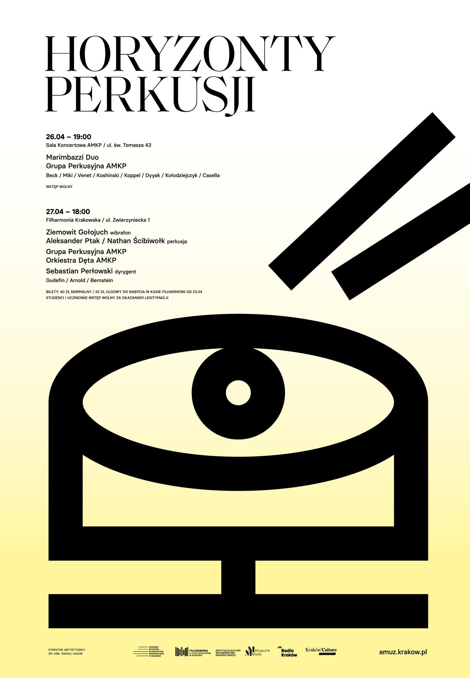
In the poster Horizons of Percussion, the visual form does not depict drums literally. Instead, it synthesizes rhythm and spatial resonance into a symbolic landscape. The viewer understands atmosphere and artistic focus before reading the title.
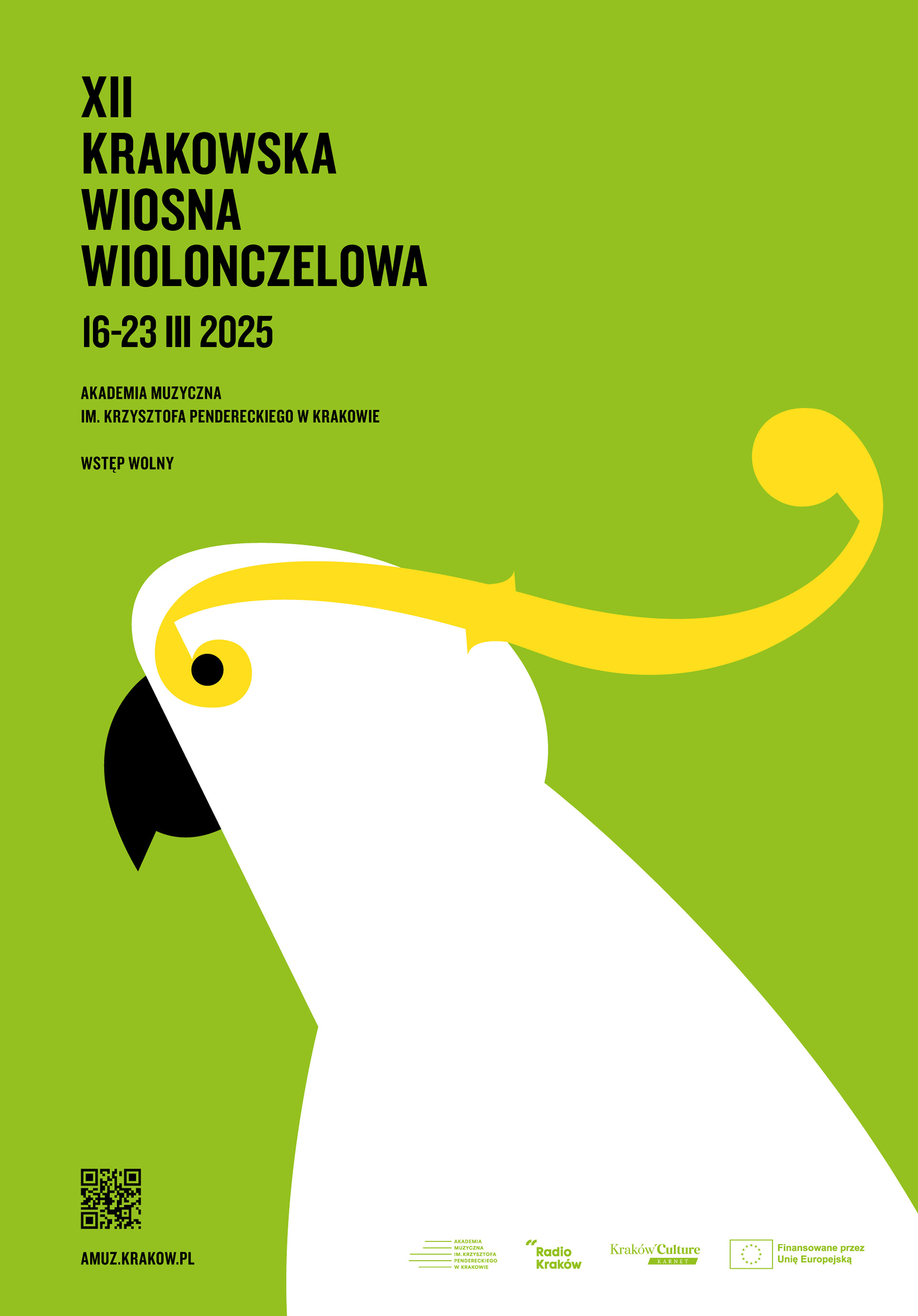
Similarly, in Krakow Cello Spring 2025, the instrument is reduced to a dynamic, almost abstract gesture. The goal is not illustration, but emotional precision.
A concept-centered poster reduces visual noise while increasing memorability.
It invites interpretation rather than explaining itself.
It invites interpretation rather than explaining itself.
2. Rhythm and Structure as Visual Counterpart to Musical Form
Music is structured in phrases, pauses, accents. Visual communication should follow the same logic.
Cognitive load theory, introduced by John Sweller, suggests that excessive visual stimuli reduce comprehension. Overloaded compositions force viewers to work harder to extract essential information. In contrast, structured hierarchy supports intuitive scanning.
Colin Ware, in Visual Thinking for Design, explains that viewers process information in predictable visual sequences: dominant element → secondary hierarchy → detail. Effective typographic rhythm guides this sequence.
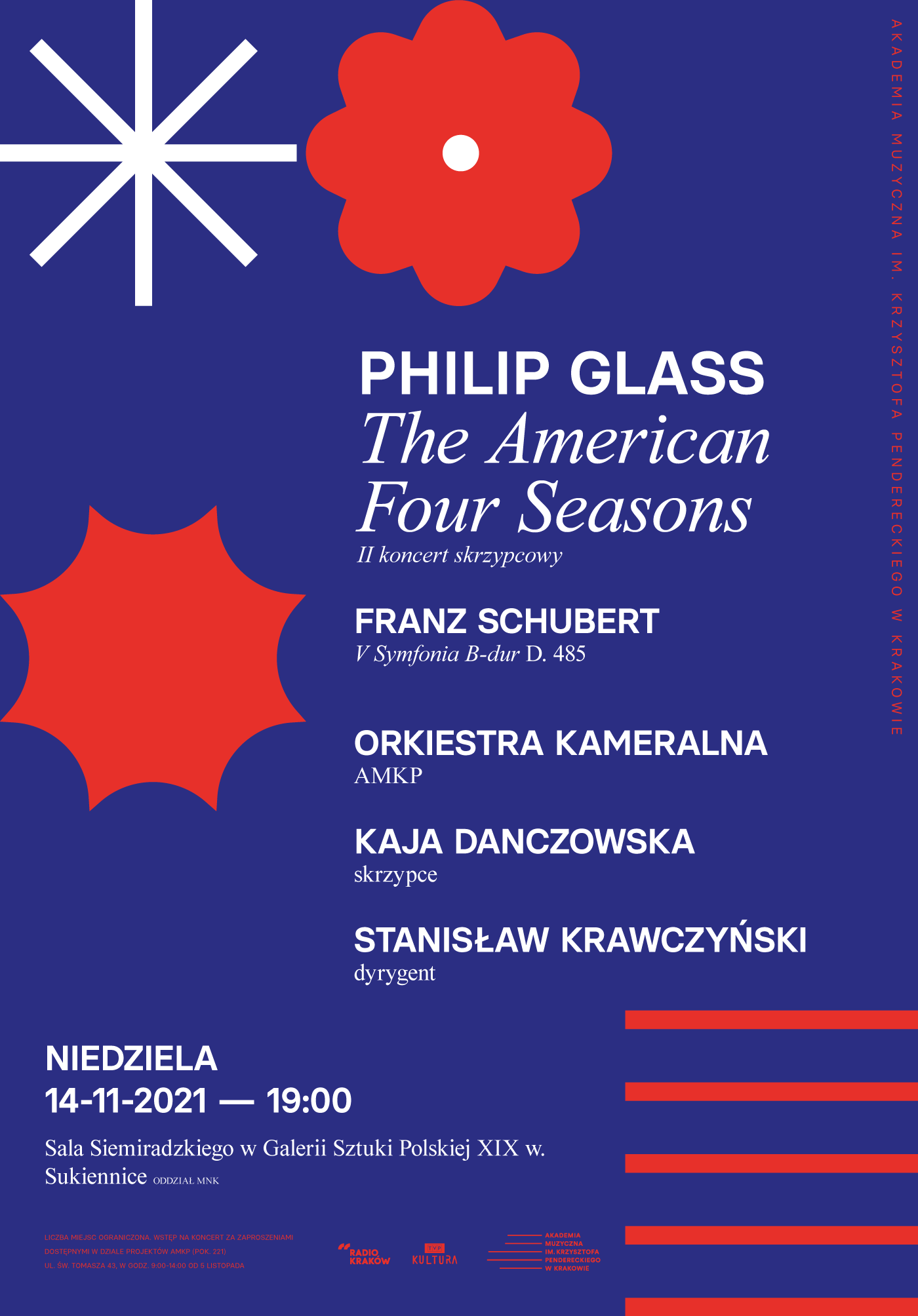
In the poster Philip Glass / Schubert, the composers’ names function as structural anchors. Supporting information flows beneath them in controlled hierarchy.
Negative space operates as silence — a visual pause that enhances clarity.
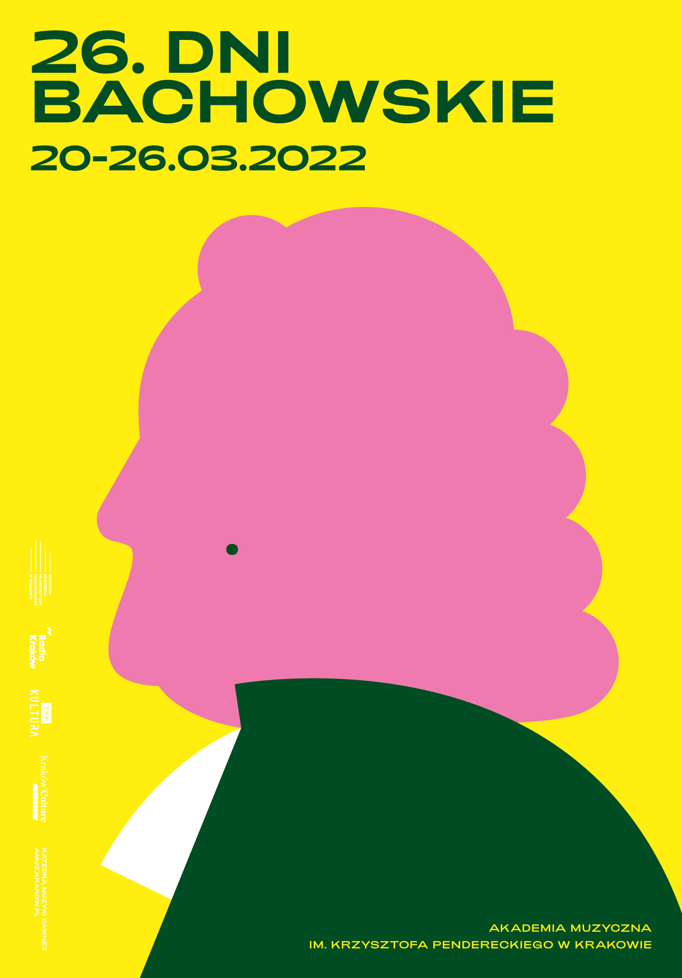
The Bach Series projects demonstrate how structural consistency builds recognition. When layout systems repeat across multiple editions, the audience begins to recognize the format even before reading content. This aligns with the UX principle “recognition over recall,” articulated by Don Norman in The Design of Everyday Things: recognition reduces cognitive effort and increases engagement.
Visual rhythm, therefore, is not aesthetic minimalism — it is structural intelligence.
3. Coherent Visual Language Across Media
Today, a poster does not exist in isolation. It is one element in a broader communication ecosystem: programs, digital banners, social media, outdoor displays.
Brand identity research — particularly Alina Wheeler’s work in Designing Brand Identity — demonstrates that consistency across touchpoints significantly strengthens recognition and perceived professionalism. Cultural institutions benefit from systemic visual coherence rather than isolated aesthetic gestures.
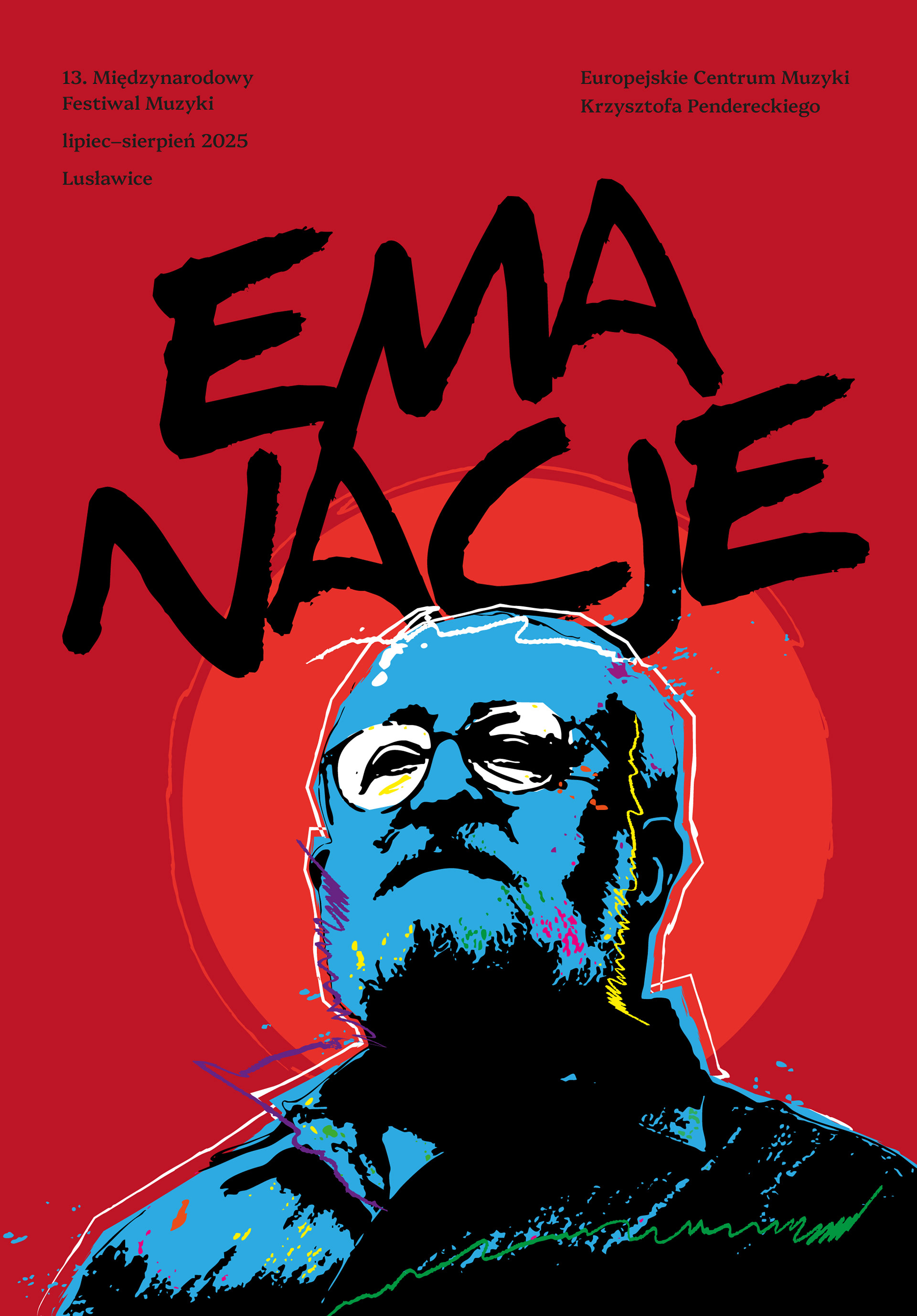
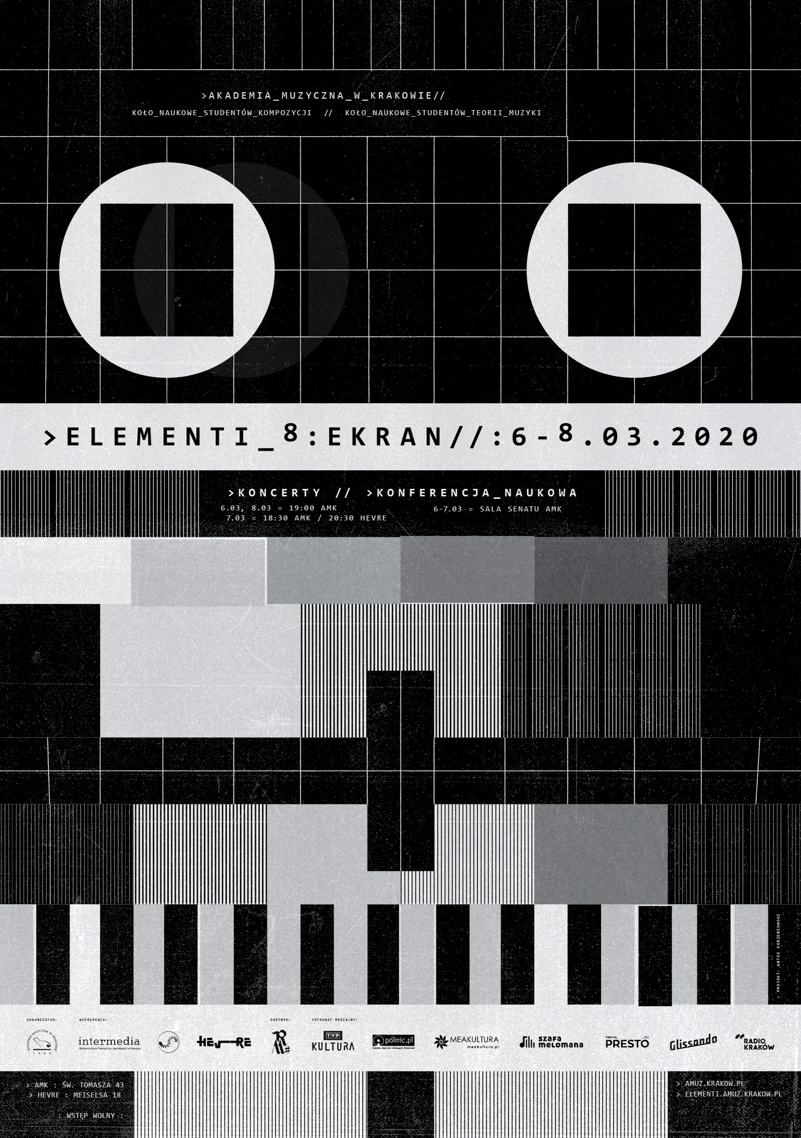
Projects such as Emanacje and Elementi illustrate how flexible visual systems can support varying artistic themes while maintaining structural continuity. A recurring typographic framework, proportion system, and compositional rhythm allow new content to emerge without disrupting identity.
A concert series designed as a system rather than as a sequence of unrelated posters builds long-term audience familiarity. The visual language becomes part of the institution’s voice.
In this sense, the poster becomes not just an announcement, but an instrument within a larger orchestration.
4. Production Responsibility in the Age of AI
Generative tools can assist early-stage exploration. However, cultural communication requires more than inspiration — it requires execution.
Donald Norman’s concept of “real-world constraints” reminds us that design must function within physical environments. A poster must withstand scaling, variable lighting, print calibration, and public space visibility.
Minimal compositions such as Requiem or Zygmunt 1521–2021 maintain legibility across formats precisely because they are built with production in mind. Large color fields are calibrated for CMYK reproduction. Typographic contrast is tested for distance readability. Proportions remain stable across print and digital adaptation.
AI may assist with ideation, but it does not evaluate print profiles, manage grid precision, or take responsibility for production standards. Design remains a discipline of informed decision-making.
Execution is not secondary to concept. It is its proof.

Beyond Promotion: Toward Visual Continuity
A concert poster should not compete with music. It should extend its structure.
When built on a clear concept, structured hierarchy, systemic coherence, and production responsibility, visual communication reinforces artistic identity rather than distracting from it.
In a saturated visual environment, restraint becomes strength. Silence becomes strategy. Structure becomes clarity.
Music is temporal architecture.
Design, when approached responsibly, becomes its visual counterpart.
Design, when approached responsibly, becomes its visual counterpart.